billboard.js 3.3 release: Non-zero based bar, stacking bar radius & more!
Excited to share the first release of 2022, the new 3.3 release 🥳 !. This release comes with 5 new features and 6 bug fixes.
For the detailed release info, please checkout the release note:
https://github.com/naver/billboard.js/releases/tag/3.3.0
What’s New?
Non-zero based bar support
Bar type is used to represent data values from zero. What if want to display a ranged data using bar?
The new support of ranged data, will make visualize in a very simple way! Just specify a range data, an array of [start, end] range, will make this happens.
Demo: https://naver.github.io/billboard.js/demo/#Chart.BarChart
data: {
  columns: [
    ["data1",
      -100, 100, 200,
      [-100, 0],  // [start, end] range array
      [0, 100],
      [100, 200]
    ],
    ["data2",
      100, 300, 500,
      [0, 100],
      [100, 300],
      [200, 500]
    ]
  ],
  type: "bar"
}
There’s no need to add nor specify options for this. If the data contains a ranged data, automatically will be drawn as ranged bar.

Stacking bar radius
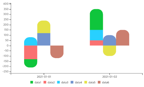
bar.radius option was given the ability to modify the shape of bar’s edge in a radius way, but only applicable for single bars.
From this release, this limitation has been removed. Now radius also applicable for grouped stacked bar also!
Demo: https://naver.github.io/billboard.js/demo/#BarChartOptions.BarRadius
Note that radius only applies for the last(in case of negative value, also include the lowest value) stacked data.

bar.indices.removeNull
When bars containing nullish values, it won’t be rendered. But when displaying the bars on each tick, the order were kept, adding some gaps between each bar shape.
This was okay, but if data contains several nullish value, make harder to visualize values.
The new option, bar.indices.removeNull comes as the rescue!
Demo: https://naver.github.io/billboard.js/demo/#BarChartOptions.BarIndices
data: {
  columns: [
      ['data1', 4, null, 4],
      ['data2', null, 3, null],
      ['data3', 1, 4, 4]
  ]
},
bar: {
  indices: {
   removeNull: true
  }
}
Simply specify bar.indices.removeNull=true.

Remove padding
The padding option, will make to adjust padding of charts area. The new alternative will let remove padding completely, to make only chart shape to be rendered.
Demo: https://naver.github.io/billboard.js/demo/#ChartOptions.Padding
{
    padding: false
}
When padding=false is set, the axes will be hidden and making shapes to fully occupy the bound element’s size.

axis.[x|y|y2].tick.culling.lines
axis.[x|y|y2].tick.culling option adjusts the appearance of tick texts in a balanced way automatically, adding the readability of tick values. But not touching visibility of the tick lines.
The new axis.[x|y|y2].tick.culling.lines option will make to control tick line’s visibility.
axis: {
    [x | y | y2]: {
       tick: {
          culling: {
              max: 5,
              lines: false  // hide tick lines
          }
Checkout the differences of x Axis tick lines.

Closing thoughts
Thanks contributors! 🙏👏
The open source project growth with the participation of contributors.
For this release, github/@ajaxlab contributed non-zero based bar feature and github/@ImADrafter contributed axis.[x|y|y2].tick.culling.lines.
We’re welcoming anyone who want to contribute to the project. This will make beneficial for all the ecosystem at all!
Until the next time all. And let’s build healthy open source ecosystem through the contribution!
