📊 billboard.js 1.12.0 release: Multi type gauge, new focused y grid line, Bubble Compare plugin & more!
Really excited to share the first new release of 2020! 🎉🎊

This release comes with 12 new features added & 19 bug fixes.
For the detailed release info, please checkout the release note:
https://github.com/naver/billboard.js/releases/tag/1.12.0
What’s New?
Multi type gauge
Demo: https://naver.github.io/billboard.js/demo/#GaugeChartOptions.GaugeTypeMulti
Prior this update, Gauge only could be represented as single level gauge or stack data similar as Pie.

From this new release, we’re adding one more option for gauge! Each data can be represented as single level gauge, providing an easy way to compare each other.
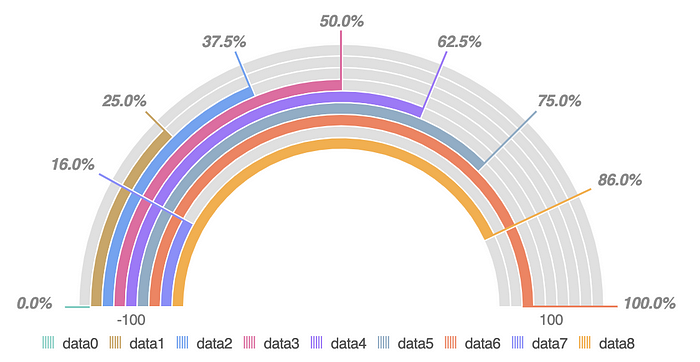
The usage is really simple as always. Just set gauge.type='multi' and done.
gauge: {
    type: "multi",
    arcs: {
      minWidth: 5
    }
  }
New focused y grid line
Demo: https://naver.github.io/billboard.js/demo/#Grid.FocusedGridLines
The focused grid line is an indicator guide line to visualize what point of data is shown currently. Basically, this vertical guide line was based on x Axis value.
In most cases, this was okay, but x Axis only based make difficult to recognize y Axis value spontaneously.
To improve this, added new focused y grid line from this release. The new ‘focused y grid line’ will point automatically data bound axis as the below screenshot.
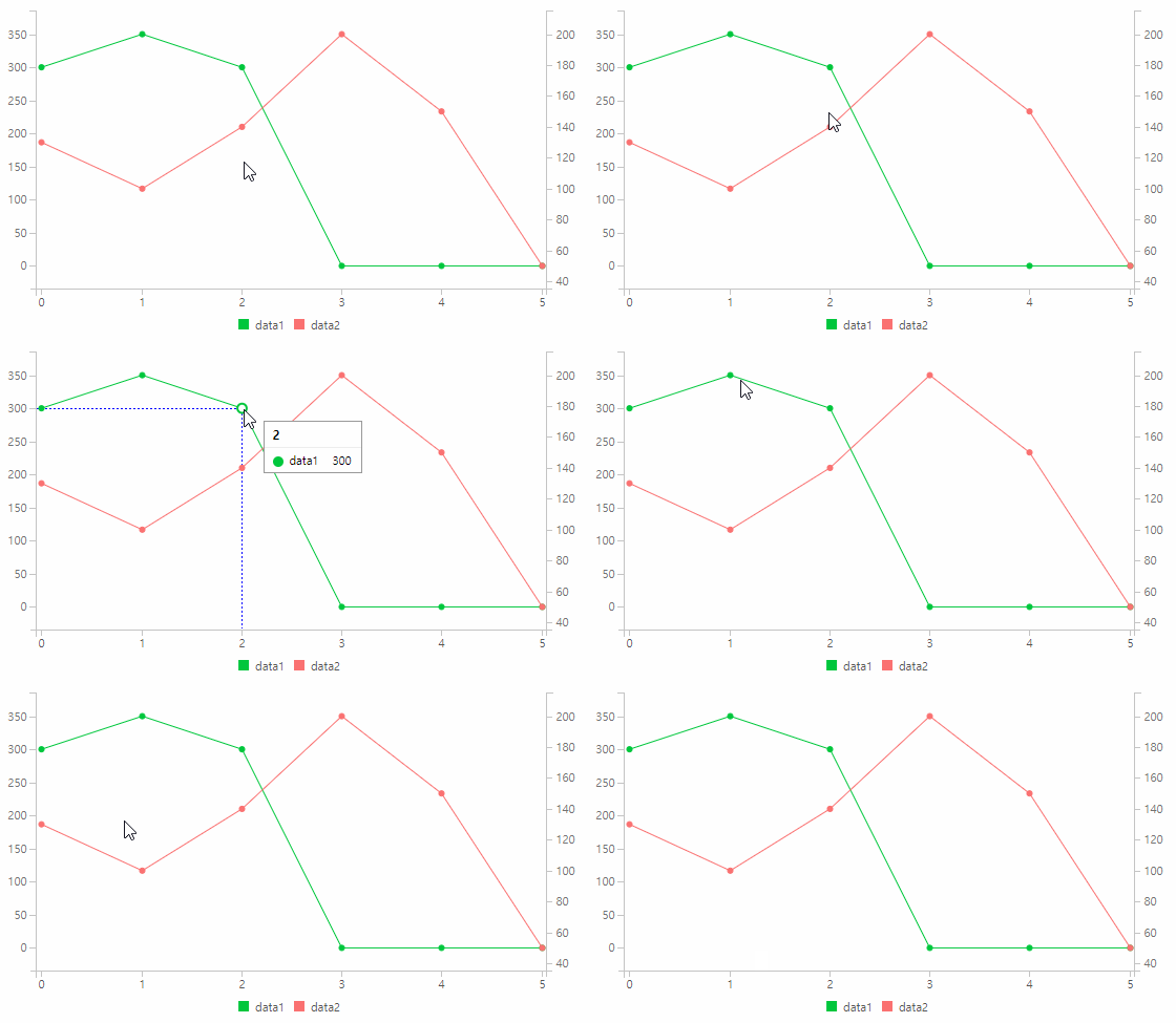
To enable, simply set grid.focus.y=true.
grid: {
  focus: {
     show: true,
     y: true,
     edge: true. // Show edged focus grid line.
   }
}
You can control how focus grid line to be displayed by grid.focus.edge option.

Donut/Gauge/Pie expand rate
Demo: https://naver.github.io/billboard.js/demo/#PieChartOptions.ExpandRate
Now you can control the expansion of the pointed data for donut, gauge and pie types.
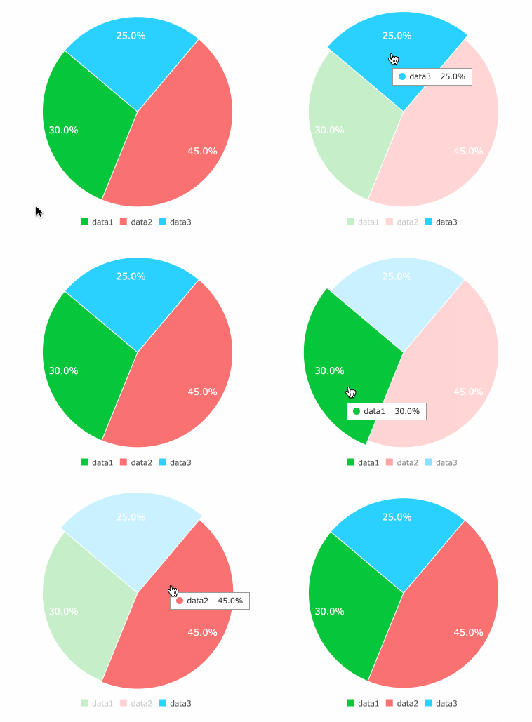
Adjust the expand rate by setting expand option.
[donut | gauge | pie] : {
    expand: {
        rate: 1
    }
}
axis.x.[min|max].fit
Let’s say you generated a chart with below options, giving min and max value to limit x Axis value.
bb.generate({
  data: {
    columns: [
      ["data1", 30, 200, 100, 100, 100],
      ["data2", 50, 20, 10, 50, 60]
    ]
  },
  axis: {
    x: {
      min: -1,
      max: 10
    }
  }
});
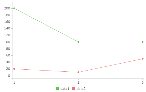
The given axis.x.min/max option, will make a spaced area on left & right side horizontally.

The newly implemented axis.x.min/max.fit option, will make to fit on bound data range.
axis: {
    x: {
      min: {
        fit: true,
        value: -1
      },
      max: {
        fit: true,
        value: 10
      }
    }
  }
But, in a case that bound data is greater than the min/max value, it will behave as before.
axis: {
    x: {
      min: {
        fit: true,
        value: 1
      },
      max: {
        fit: true,
        value: 3
      }
    }
  }
New axis.y2.tick.rotate option
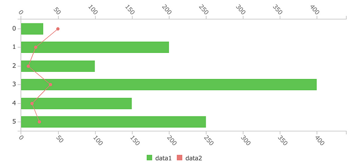
The tick.rotate option makes tick texts rotated, useful to represent wide spaced text in limited width size. When axis.rotated=true is set, y and y2 Axes also needed apply rotate options in some circumstances.
From this release, by setting tick.rotate for y or y2 Axes, you can make this happens.
axis: {
     // y, y2 axes rotate works only when axis is rotated
     rotated: true,
     y: {
       tick: {
         rotate: 50
       }
     },
     y2: {
       show: true,
       tick: {
         rotate: 50
       }
     },
   }
New axis.[y | y2].tick.stepSize
Demo: https://naver.github.io/billboard.js/demo/#Axis.StepSizeForYAxis
With the new axis.[y|y2].tick.stepSize, adjusting the intervals of tick values became more easier.
axis: {
    y: {
      tick: {
        stepSize: 33
      }
    },
    y2: {
      show: true,
      tick: {
        stepSize: 20
      }
    }
  }
Given stepSize option, the ticks will be displayed having given intervals.

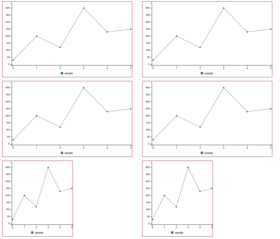
New [bubble | line | scatter].zerobased
New added zerobased option will make y Axis to start from 0, instead giving a padded value(default).
The below screenshot displays the differences between the padded(the first screenshot) and without padding (the second).

The usage is simple and straightforward.
[bubble | line | scatter]: {
    zerobased: true
}
New Bubble Compare Plugin
The newly added bubblecompare plugin, will facilitate visually comparing values using bubble type. Comparing data 3-dimensional ways, x axis, y axis & bubble-size.
The demo link, will show a simple comparison of population of each countries using this plugin. Where Value x represent population density, Value y for Area and Value z population.
Demo: https://naver.github.io/billboard.js/demo/#Plugins.BubbleCompare
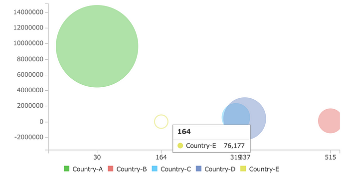
The plugin provides three simple options to be configured.
plugins: [
    new bb.plugin.bubblecompare({
     minR: 11,
     maxR: 74,
     expandScale: 1.1
    }),
  ]
axis.x.tick.autorotate
According the dimension where chart is displayed, adjusting the full display of the axis tick texts was a challenge. Because of this reason, tick.rotate comes to the rescue.
But, tick texts remains rotated even it has enough space to be shown.
To mitigate this, introduced new axis.x.tick.autorotate option.
Demo: https://naver.github.io/billboard.js/demo/#Axis.XAxisTickAutorotate

As shown from the above screenshot, the x Axis tick text rotate changes according the size where is displayed.
axis: {
    x: {
      tick: {
        fit: true,
        multiline: false,
        autorotate: true,
        rotate: 15,
        culling: false,
        count: 10
      }
    }
  }
Changes might you need to know
Tooltip enhancements
a) callback option
Improve tooltip’s on callback options(onshow, onshown, onhide, onhidden) passing the current chart context and current dataset.
tooltip: {
    onshow: function(ctx, currentData) {
        ctx; // current chart instance
        currentData;  // current tooltip dataset
        /*
        [
              {x: "2020-01-18T15:00:00.000Z", value: 33103, id: "data1", index: 6, name: "data1"},
                ...
        ]*/
    }
}
b) positioning
As of pointing rightest data point, if the mouse pointer located near data point, tooltip is appearing over data point. Which makes data point invisible.
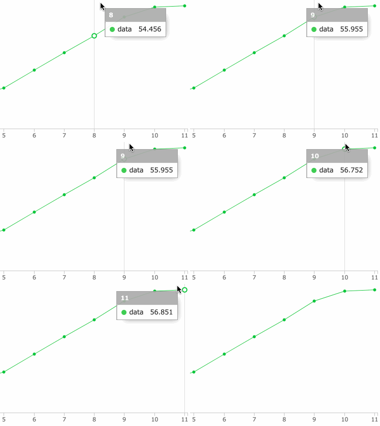
From this release, tooltip position will be adjusted for rightest positioned data points to not overlap data points.
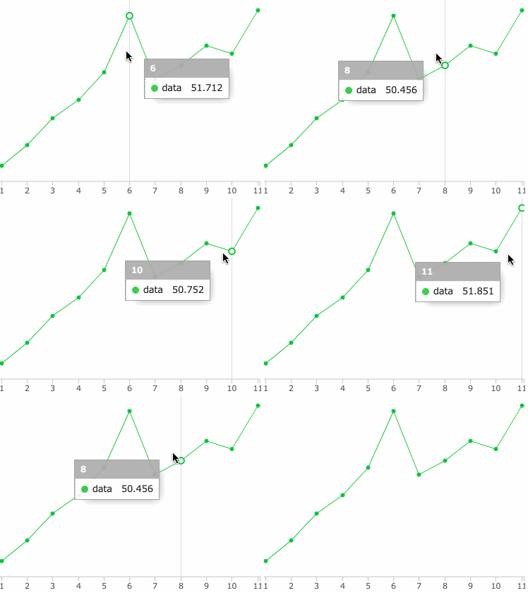
c) updates for touch devices
For touch devices, the basic interaction differs as the desktop one.
For desktop environment, to retrieve data values and the tooltip display, it can be done by the mouse moves. But, for touch devices this interaction is done by user touch.
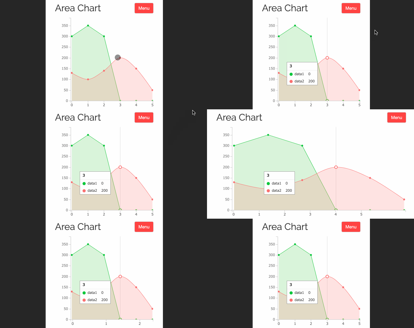
Previously, billboard.js wasn’t maintaining current data point selection when resize(like screen rotation) happens and was a bad user experience.
From this release, the states of the current data point selection will be remained for this usage scenario.
zoom.resetButton.onclick
New callback option, zoom.resetButton.onclick is added. The ‘Reset Zoom’ button is displayed when drag zoom-in is applied.
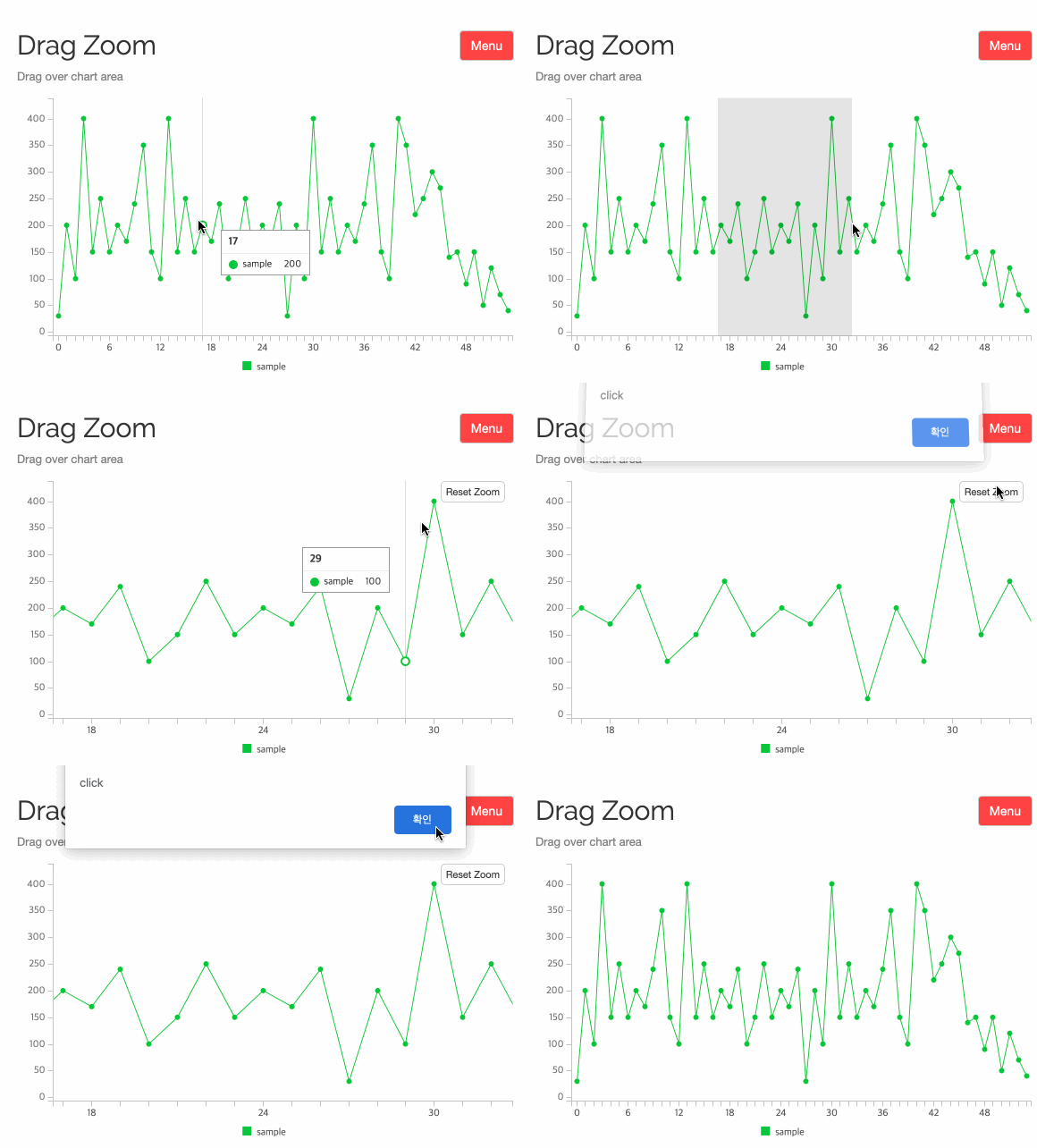
This new option, simply make a call of function when the ‘Reset Zoom’ button is clicked.
zoom: {
     enabled: {
         type: "drag"
     },
     resetButton: {
         onclick: function(button) {
            button; // Reset button element reference
            ...        }
    }
}
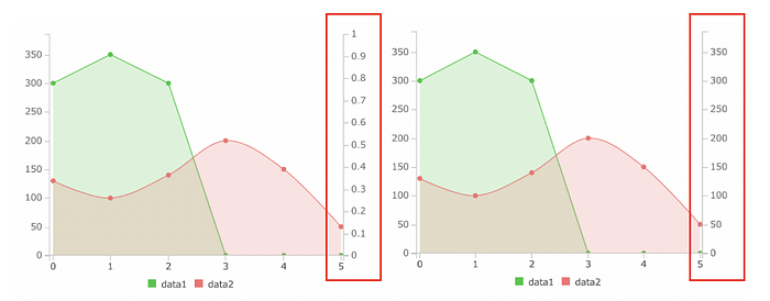
Update on axis.y2 domain
Previously, when set to show y2 Axis, the default domain values was [0, 1].
As the below screenshot shows, y2 Axis domain was a meaningless not having any correlation with the data values.
To improve this, if no data is bound to y2 Axis, its domain will defaults to the y Axis domain value.
The great Contributors!
This release could be possible because of the hard work of all contributors. Thanks for your support!
- ‘Multi type gauge’, ‘x axis tick autorotate’ and ‘update on axis.y2 domain’ by https://github.com/michkami
- Bubble Compare plugin by https://github.com/jm-chong
And some minor(but also great) contributions from:
https://github.com/zhongdeliu, https://github.com/ECrownofFire
What’s Next?
We’re working very hardly for the next major v2 version. You can find its early implementation from:
Main Goals of v2 are:
- Move codebase to TypeScript
- Restructure of file system & class architecture
- Make smaller build & run faster
- Do not break backward compatibility
We won’t providing a due date for this, but we’re planning to release within 2~3Q of this year.
As always, thanks for all contributors and all users!
Stay well and healthy until the next release.

