billboard.js 1.9 release: Introducing plugins & more!
It’s been for a while and is the time to release the new 1.9 release.
This release comes with 12 new features added & 14 bug fixes.
For the detailed release info, please checkout the release note:
https://github.com/naver/billboard.js/releases/tag/1.9.0
What’s new?
Introducing Plugins: Stanford Diagram
Plugin was a long waited feature, but to be implemented it needed to establish ‘plugin’ interface first.
The initiative of this was triggered by github/@FreezinG117, who contributed the new ‘Stanford Diagram’ type.
Demo: https://naver.github.io/billboard.js/demo/#Plugins.StanfordDiagram
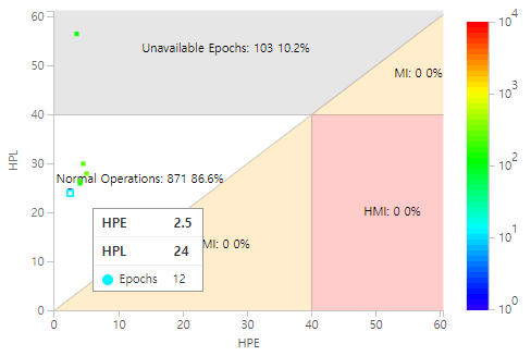
Stanford Diagram is:
Integrity-Availability-Accuracy 2D histogram based on Satellite Based Augmentation Systems(SBAS). Shows the relationship of position errors against protection levels for a set of measurements using an all in view satellite selection.definition from: navipedia
As of the merge, we thought it’ll be more practical implement as one of plugin. We started to design interface and transformed the PR to adapt the plugin interface.
The technical documentation about plugin can be found from the below link:
https://github.com/naver/billboard.js/wiki/Plugin-Interface
Anyone can write plugin. If you want to be distributed as part of billboard.js, you need implement the ‘Plugin Interface’. Otherwise you can design as you want — the only rule is following ‘lifecycle hook’ described from the interface doc.
So, if you have a grate idea, don’t hesitate to make one :)
Enhancement on gauge: stack data
Until now, ‘gauge’ type was used to represent how the data is scaled against the max value. It’s like a speedometer.
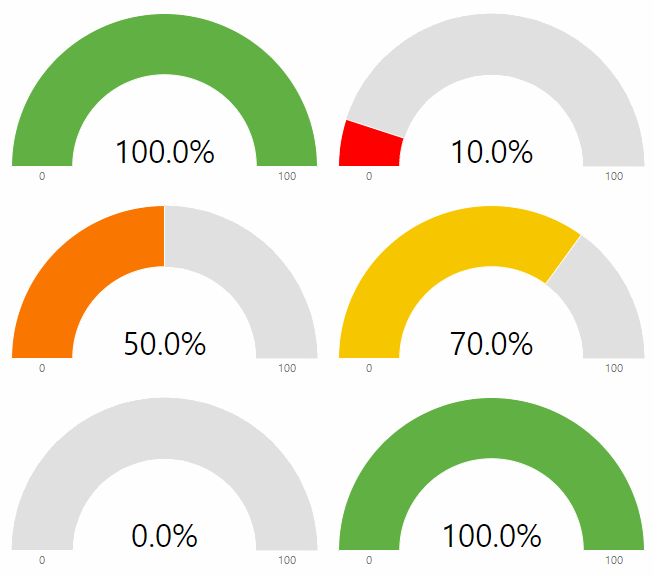
The lack on this is you can display only one data at a time.
To break this limit, we added an enhancement to display multiple data like pie has.
Demo: https://naver.github.io/billboard.js/demo/#GaugeChartOptions.GaugeStackData

There’s nothing additional to use. Just add multiple data as usual on ‘gauge’ type.
bb.generate({
  data: {
    columns: [
      ["data1", 30],
      ["data2", 190]
    ],
    type: "gauge"
  }
});
The default percentile text at the center was displayed automatically on the previous gauge type, but if you bind multiple data, there’s no way to show some text content.
For this occasion, one more additional option ‘gauge.title’ can be used.
gauge: {
   title: "Title A"
}
For more details, checkout the API doc.
https://naver.github.io/billboard.js/release/latest/doc/Options.html#.gauge
Tooltip: Template contents & display control
a) tooltip.contents.template
To format tooltip as you need, probably you might struggled assembling HTML strings within tooltip.contents option.
It wasn’t bad, but I admit that wasn’t efficient at all. So, to facilitate this tedious task, introduced a template based capability to customize your tooltip contents easier!
tooltip: {
  contents: {
    template: "<ul><li>Index<br>{=TITLE}</li>{{<li class={=CLASS_TOOLTIP_NAME}><span>{=VALUE}:{=VAR}</span><br><span style=color:{=COLOR}>{=NAME}</span></li>}}</ul>"
    }
  }
}
You can make a customized HTML with the minimalistic template syntax.
With this template, you can combine tooltip.contents.text option to display additional text value within template.
b) tooltip.contents.text
Each key value set, will be used as the variable name within template. From the below example ‘VAR’ key name is used as the representation of the text value set.
contents: {
    text: {
        VAR: ["A", "B", "C"]
    },
    template: "<ul><li>Index<br>{=TITLE}</li>{{<li class={=CLASS_TOOLTIP_NAME}><span>{=VALUE}:{=VAR}</span><br><span style=color:{=COLOR}>{=NAME}</span></li>}}</ul>"
    }
},
c) tooltip.contents.bindto
With this option let you bind template contents on the element you want, giving more freedom to be displayed anywhere.
tooltip: {
 contents: {
  bindto: "#my-tooltip" // will bound to <... id="my-tooltip">
 }
}
d) tooltip.doNotHide
The normal behavior for tooltip is being displayed from mouseover(or touch) interaction and hide after the leave.
With this option, will let to not hide tooltip to keep displaying.
tooltip: {
    doNotHide: true
}
Let’s combine all together
Combining all the above option, you can make a customized tooltip to be displayed without interfering interaction on chart area.
Demo: https://naver.github.io/billboard.js/demo/#Tooltip.TooltipTemplate
Sensitivity for Bar & Pie
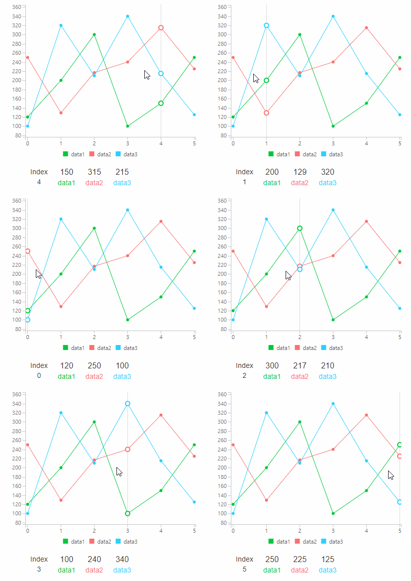
The point.sensitivity option let control the sensitivity(distance) on your mouse coordination against the representation of the data elements.
The amount of sensitivity value means how ‘sensitive’ is to interact with the data.
point: {
 sensitivity: 5
}
From the below example:
- senstivity=10: Going closer to each data boundary, notice that tooltip is showing two data values as overlapped.
- senstivity=0: It doesn’t show two data. Only show one data as the coordinate moves.

Try the screenshot example: https://jsbin.com/luwisoz/edit?html,js,output
Data Labels: Color & Position
a) data.labels.colors
Until now data label text’s color was bound to data’s color. Is okay in many circumstances, but having some limits are’t good.
To give more space on this, added new data.labels.colors option.
Demo: https://naver.github.io/billboard.js/demo/#Data.DataLabelColors
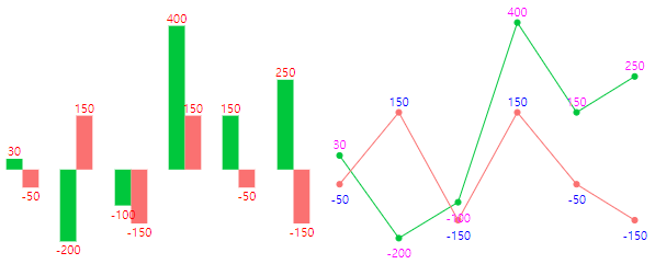
The usage is simple & straightforward. Specify color value for all dataset, or for each.
data: {
  labels: {
    // apply for all label texts
    colors: "red",

    // or set different colors per dataset
    // for not specified dataset, will have the default color value
    colors: {
      data1: "yellow",
      data3: "green"
    }
},
b) data.labels.centered
The new data.labels.centered option can be used with the ‘bar’ type, letting align text at the center of bar element.
For example, if you want display a white colored text at the center of bar shape, you can combine with the data.labels.colors option together.
labels: {
  colors: "white",
  centered: true
}
Pie: Enhancement on innerRadius
The existing pie.innerRadius option, let customize the radius of pie. With this release extended to specify value for each dataset.
With this addition, you can emphasize some data giving more clear difference than others.

// set different innerRadius for each data
pie: {
    innerRadius: {
        data1: 90,
        data2: 90,
        data3: 0
    }
}
Radar: Multiline Axis Text
A small enhancement was added. As the extension of ‘multiline’ texting capability, for this time was applied for radar Axis text.
Demo: https://naver.github.io/billboard.js/demo/#RadarChartOptions.RadarAxisMultiline
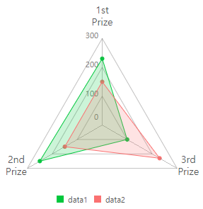
Just add ‘\n’ new line char like others options. This time add on the declaration of axis text value as below example. And don’t forget adding a space on the top in case of your top axis text being clipped.
bb.generate({
  padding: {
    top: 25
  },
  data: {
    x: "x",
    columns: [
      ["x", "1st\nPrize", "2nd\nPrize", "3rd\nPrize"],
      ["data1", 230, 250, 100],
      ["data2", 150, 150, 230]
    ],
    type: "radar",
    labels: true
  },
  radar: {
    axis: {
      max: 300
    }
  },
});
Global Configuration
If you use multiple charts generated within page, maybe options are used repeatedly.
To not repeat over and over again, maybe you have some global definition at the top on your code.
The new .defaults() method is kinda same idea, but let be more explicit.
// set global configuration at the top
bb.defaults({
    data: {
       type: "bar"
    }
});

// now for every generation, `data.type` defaults to 'bar'
bb.generate({ ... });
bb.generate({ ... });bb.defaults();  // will return: {data:{type: "bar"}}
Stats
Update: stat was removed from 1.9.5 release as of concerns.
https://github.com/naver/billboard.js/issues/964
The last addition is stats option. This was added mainly to collect usage statistics, because we felt very difficult to find a “realistic” usage data.
This will be used only for statistic reason only and will not be hurting user experience at all.
If you don’t want data to be sent, you can turn off anytime using new .defaults() API or with stat option.
// turn off globally
bb.defaults({stats: false});// or from generation option
bb.generate({
    ...,
    stats: false
});
And some small updates you might know
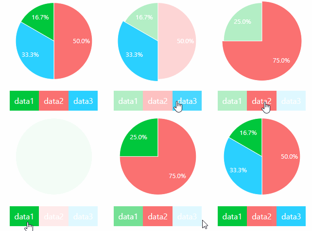
Custom legend behaves
Custom template legend updated to behave as normal legend behaves.
As you can see from the below screenshot, when do mouseover/toggle will make each legend item being applied opacity value to represent show/hidden states.
The remove of bar stroke style
Removed the inline stroke property on bar element. Is due to give more styling flexibility.

Now you can style different stroke color for bars to give different bar styling by defining a CSS rule.
.bb-chart-bar path {
   stroke: blue;
   stroke-width: 1px;
}
What’s Next?
Thanks for all the contributors and for all who reported issues as always. We can make improvements based on your work and this definitely will help all billboard.js users!
The next steps will be applying an automated release process(a great contribution from github/@austince) and work for the 2.0.
We’re welcoming any kind of contribution, so don’t hesitate doing that.
Stay well until next release!
