The chart library: billboard.js 1.8.0 released today!
Super excited announce the new release of the billboard.js today!
This release includes 6 new features and 17 bug fixes,.
For the detailed release info, please checkout the release note:
https://github.com/naver/billboard.js/releases/tag/1.8.0
What’s New from the release?
Let’s change color when is over!
To indicate current data selection, vertical focus line is well enough in all circumstances. But sometimes you want to emphasize to show clear indication applying some color changes at chart elements(when it goes to mobile environment, this can be more useful because of the touch based interaction).
To facilitate these tasks, color.onover option is introduced from this release.
Demo: https://naver.github.io/billboard.js/demo/#ChartOptions.ColorOnover
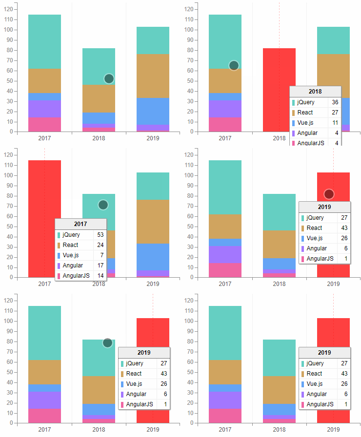
This option allows updating data element’s color and is fully configurable.
// set all data to 'red'
onover: "red",// set different color for data
onover: {
    data1: "red",
    data2: "yellow"
},// will pass data object to the callback
onover: function(d) {
    return d.id === "data1" ? "red" : "green";
}
Full display control for axis tick
In most circumstances, axis are shown as is, but sometimes there’re needs to customize the display of each parts.
Demo: https://naver.github.io/billboard.js/demo/#Axis.HideTickLineText
One real example will be using ‘subchart’. From the below screenshot, you might want to get rid the subchart axis texts. Because they’re not really useful.
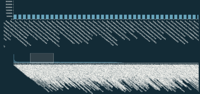
Even isn’t provided an option, the displaying of the elements can be controlled by CSS. But in this case isn’t helpful, giving a gap between legend elements.

To solve this issue, and will be helpful for some circumstances, added new axis tick display control option.

This option let control the visibility of the tick(the line) and tick text.
x: {  // same for 'x', 'y', 'y2' and subchart axis
	tick: {
		show: true,  // show or hide tick lines
		text: {
			show: true  // show or hide tick texts
		}
	}
}
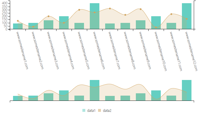
With this new option, will solve the example mentioned earlier removing the gap between the subchart and the legend.
Variant width on bars
Usually bar elements are visualized with the same width, but having different width size can give different visualization experience to be distinguished one from others.
Demo:https://naver.github.io/billboard.js/demo/#BarChartOptions.BarWidthVariant
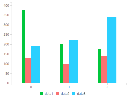
Simply set ratio or pixel values for each dataset.
bar: {
    width: {
    	data1: {
	     ratio: 0.2,
	     max: 20
    	},
    	data2: 30
    }
}
Multilined text
Adding break lines are quite annoying task in SVG. To facilitate, billboard.js added functionality to break the line using ‘\n’ char where is applicable.
As an extension of this, Pie/Donut data text label and title where added on this list.
- Multine text enhancement for Pie/Donut
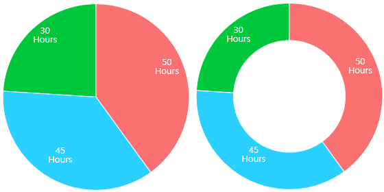
Demo: https://naver.github.io/billboard.js/demo/#PieChartOptions.MultilineLabel
pie: {  // donut also as well
    label: {
        format: function(value, ratio, id) {
            return value +"\nHours";
        }
    }
}- Multilined Text
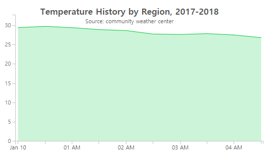
Demo: https://naver.github.io/billboard.js/demo/#Title.MultilinedTitle
title: {
    text: "Temperature History by Region, 2017-2018\nSource: community weather center"
}
LinearGradient for Area types
Background gradient is one design/UX factor to display area type charts. To accomplish this, added new area.linearGradient option.
Demo: https://naver.github.io/billboard.js/demo/#AreaChartOptions.LinearGradient
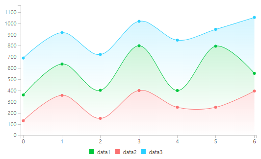
The usage is very simple. Just set to true if you want to apply gradient. From this setting will apply a ‘default’ gradient to all area datasets with their original colors.
// will generate follwing linearGradient:
// <linearGradient x1="0" x2="0" y1="0" y2="1">
//  <stop offset="0" stop-color="$DATA_COLOR" stop-opacity="1"></stop>
//  <stop offset="1" stop-color="$DATA_COLOR" stop-opacity="0"></stop>
// </linearGradient>linearGradient: true,
What about if you want apply customized one? Of course you can.
To customize, you need to have little knowledge about on SVG’s <linearGraient> element, but isn’t really difficult.
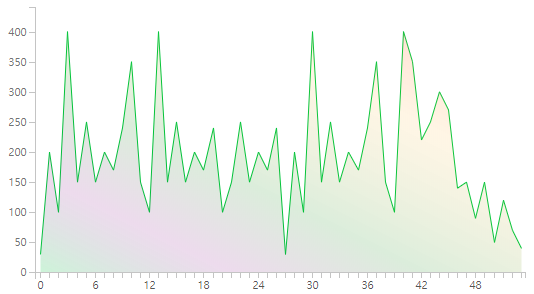
The above gradient settings are:
// Or customized gradient
linearGradient: {
 x: [0, 0],  // x1, x2 attributes
 y: [0, 0],  // y1, y2 attributes
 stops: [
  // offset, stop-color, stop-opacity
  [0, "#7cb5ec", 1],  // setting 'null' for stop-color, will set its original data color
  [0.5, null, 0],  // setting 'function' for stop-color, will pass data id as argument.
  // It should return color string or null value
  [1, function(id) { return id === "data1" ? "red" : "blue"; }, 0],
 ]
}
Improved performance
Performance is one of the main key to be considered. We were putting efforts on these, but it can not be done all at once.
From this release, refactoring were made for the performance. As a start, of this, we focused in 3 different categories on this release:
- Do not generate unnecessary nodes if they aren’t necessary.
- Get rid the duplicated calls to minimize execution calls.
- Memoize some dimension values to not evaluate multiple times.
Of course, this is just the one step only. The effort on this will continue among the future releases.
Small benchmark
We did some small benchmark to measure the difference and here are the results.
Test condition:
- Total of 30 datasets, which each has length of 30 dataThe resources(CPU, JS heap size and DOM Nodes) values aren't really accurate, just take as a consideration.
The first benchmark is about loading dynamic datasets using .load() API.
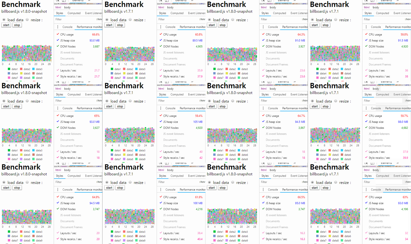
The counts measured of layouts and Style recals:
- v1.7.1: 33~42/sec
- v1.8.0: 16 ~ 24/sec
The second is about resizing window via .resize() API.

The counts measured of layouts and Style recals:
- v1.7.1: 51~66/sec
- v1.8.0: 12 ~ 39/sec
As you can see from the result, roughly dropped +50% in these two tests. Hope this be beneficial for billboard.js users :)
Small tip
One best way to improve the performance is turning-off the transition. Is kinda obvious, but just one setting will mitigate the cost of rendering.
As you can see from the below test, the rate of Layout/Style recalcs dropped dramatically comparing the previous tests, in a average of 4/sec.
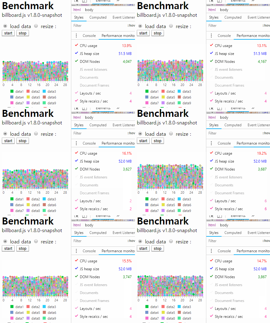
Turing-off is simple. Just set transition.duration value to 0 or null.
transition: {
    duration: 0  // or null
}
Closing
I’d like to address thanks to all users and the contributors. And hope these efforts let facilitate on your tasks!
If you have any ideas, comments or want to make any contribution, please don’t hesitate doing that.
This project needs your attention to move forward. Please try giving back what you’ve been received from the OSS project.
If you’re interested how OSS projects are sustained, checkout some articles:
- Open source sustainability
- Roads and Bridges: The Unseen Labor Behind Our Digital Infrastructure
- The Internet Was Built on the Free Labor of Open Source Developers. Is That Sustainable?
