billboard.js 1.11.0 release: Lazy render, new TextOverlap plugin & more!
This release comes with 7 new features added & 14 bug fixes.
For the detailed release info, please checkout the release note:
https://github.com/naver/billboard.js/releases/tag/1.11.0
What’s New?
Lazy Rendering
The lazy rendering functionality make render lazily when chart bind element visibility is hidden. And when element turn to be visible, automatically renders the chart.
Demo: https://naver.github.io/billboard.js/demo/#ChartOptions.LazyRender
Imagine constructing a hidden element at the initialization on your page for different purpose like ‘Tab based UI’. And when user clicks/tap the ‘tab’, it changes its visibility state and that’s the time to make displaying chart.
Let’s see an example in action. The chart element is hidden, but when chart element display prop changes, it renders automatically.

// (1) Initial state
<div id='chart' style='display:none'></div>// (2) Generate chart as usual, but it won't be rendered until '#chart' element visibility change automatically.
const chart = bb.generate({
    bindto: "#chart",
    ...
});// (3) Update the visibility to make chart to be rendered
document.getElementById('chart').style.display = 'block';
If you need handle rendering more in detail, you can use render option for that.
render: {
    lazy: true,     // Make to not render at initialization
    observe: false  // Observe bind element's visibility
}
new TextOverlap Plugin
The new “TextOverlap” plugin prevents label text overlap using Voronoi layout from the excellent contribution by github/kimberlybaum!
Demo: https://naver.github.io/billboard.js/demo/#Plugins.TextOverlap
Data label text can be overlapped according its data value and it gets worse if there’re lots of dataset to be displayed. In this scenario, TextOverlap plugin comes to play to solve the issue.

Based on Voronoi layout, it makes to be positioning label texts nicely.
const chart = bb.generate({
    data: {
       columns: [ ... ]
    }
    ...
    plugins: [
       new bb.plugin.textoverlap({
         // selector for data label text nodes
         selector: ".bb-texts text",
         // extent of label overlap prevention
         extent: 8,
         // minimum area needed to show a data label
         area: 3
       })
    ]
 });
donut/pie.startingAngle
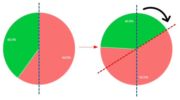
New startingAngle option for donut & pie, gives the control of start angle where it draws.
Demo: https://naver.github.io/billboard.js/demo/#DonutChartOptions.StartingAngle
Checkout the below example screenshot.
The left image show the normal(default) starting angle, where it begins top-centered position. The right image is when set different starting point.

The usage is really simple. Just set starting angle value for donut & pie.
donut: {
    startingAngle: 0.7
},
pie: {
    startingAngle: 1
},
axes.domain
The axes options for x, y and y2 Axis, makes to add multiple axes for each Axis. But the added Axes’ tick scales was bound to its main Axis, where making harder if you need display different scale than its original value.
The new axes.domain option, makes this possible facilitating show different scale values.
Demo: https://naver.github.io/billboard.js/demo/#Axis.MultiAxesDomain
Checkout the example below. The y2 Axes tick texts are bound to the main y2 Axis. The y Axes tick having a [0, 1000] domain value, differ from its main y Axis scale value.

[x|y|y2]: {
   axes: [
     {
       // set new domain value
       domain: [0, 1000],
One thing to remember on this. Normally, the Axis’ scale is bound to its data value. But specifying different domain value, it means there’s no relation with the data value. In this case, the interaction of data(toggling, new data load, etc.) will not be affected for added axes.
Improved data.labels.position
data.labels.position option makes positioned data label texts in different position relatively its original position.
But it had a limitation where it couldn’t be controlled by each data. To improved on this, an enhancement were added from this release.
Demo: https://naver.github.io/billboard.js/demo/#Data.DataLabelPosition

The usage is really simple. Just specify x/y coordinate value for each dataset and all done.
position: {
     data1: {x: 5, y: 5},
     data2: {x: 10, y: -20}
}
background
Added new background option, where you can add background’s image or colred background.
Demo: https://naver.github.io/billboard.js/demo/#ChartOptions.Background

Adding a background is really simple. Just specify the value you need.
background: {
   class: "myClass",
   color: "red",   // Set image url for background.
   // If specified, 'color' option will be ignored.
   imgUrl: "https://naver.github.io/billboard.js/img/logo/billboard.js.svg",
}
data.onover/out
The data.onover/out option callback has a small improvement. From this reelase, the callback will receive second argument.
The new argument will have the reference of the where onover/out event triggered. This will facilitate controlling data points more easily.
data: {
    onover/out: function(d, element) {
       // d - ex) {x: 4, value: 150, id: "data1", index: 4}
       // element - <circle>
       ...
    }
}
Changes might you need to know
Legend behaviour in Gauge
By default, for gauge type was disabled displaying legend. This was okay when displaying one data only.
But with the addition of stack data in gauge, arose the necessity of knowing and distinguishing each other.

From this release, legend display is enabled by default. So, if you want hide legend as before add legend.show = false option.
The great Contributors!
This release could be possible because of the hard work of all contributors. Thanks for your support!
- TextOverlap plugin by https://github.com/kimberlybaum
- Performance improvements by https://github.com/dpraul
- Build optimization by https://github.com/stof
- Type definition by https://github.com/qkreltms
What’s Next?
For this year was planned the next major 2.0, but facing a lot of difficulties handling issues and lack of resource the work has been posponed for next year.
As always, thanks for all contributors and all users!
Stay well until the next release.
